Design
SOAR is a local support group in Middle Tennessee. The group and I had a great time drawing up ideas - kids and adults - great creative energy - then we looked at all of our creations and saw that a rainbow dandelion was good. Working from a talented young gal’s sketch I came up with this rainbow dandelion. A thrilling challenge. Then we worked out fonts and presentation. The entire group felt a sense of accomplishment and ownership for their new logo. Great collaboration time.
This started as a passion project to honor and immortalize the magic work of my father, and all of the “stick-and-rudder cowboys” who flew the Catalina Seaplanes. So, I created images of all of the airlines from 1931-1989, and their design variations. Word got around and I was contacted by Catalina Island for merchandise rights, a museum backdrop and then this image for the Catalina Airline Pilots Reunion t-shirt. People often mistake these images of the planes for photos but they were created ex nihilo in Illustrator piece by piece in vector glory - then smudged here and there in Photoshop. I believe the shirt is still sold on the Island to this day.
While working for an ad agency in Southern California I got to work on this logo piece with Civic Communications. A very professional company with a fantastic eye for design and color.
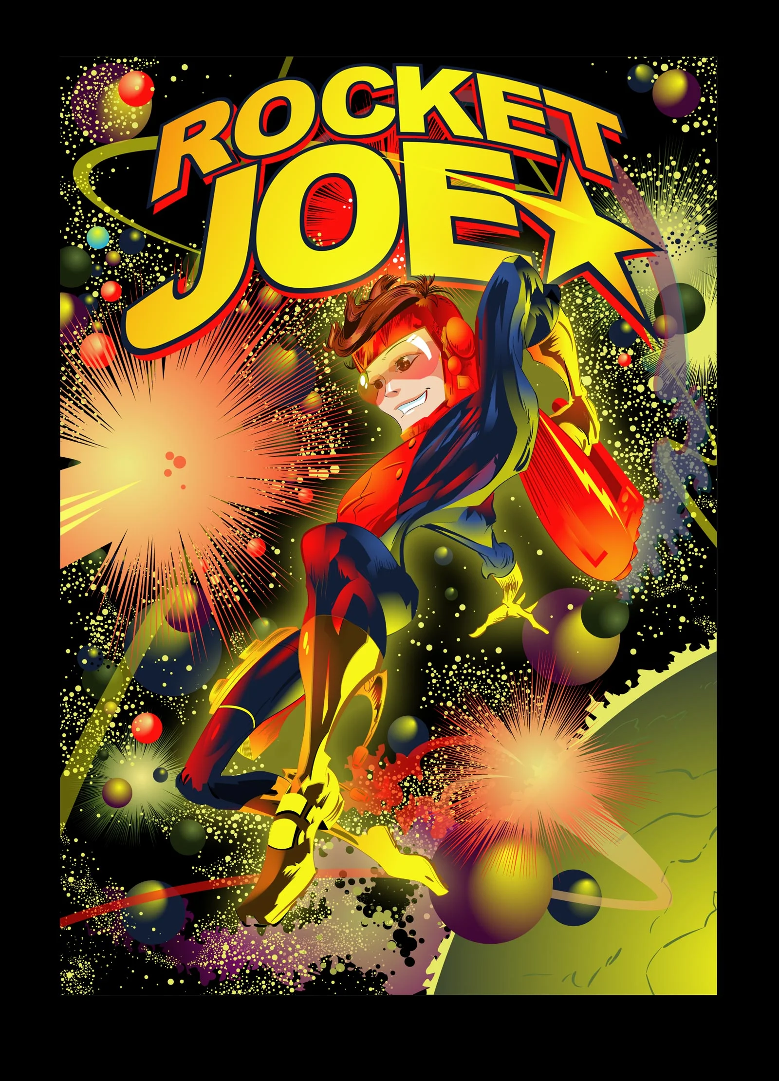
Vintage space hero-kid image I created just cuz. Enjoyed maxing the motion, form, action, force and soaring color.
Logo for Susan Michelle Compass, a travel essentials company. We had a great time talking about the project and the things of coming alive - comps were made and we pursued this look. Their company colors and spirit were infused and the call of well-prepared adventure was made with simple, yet responsible, elegance.
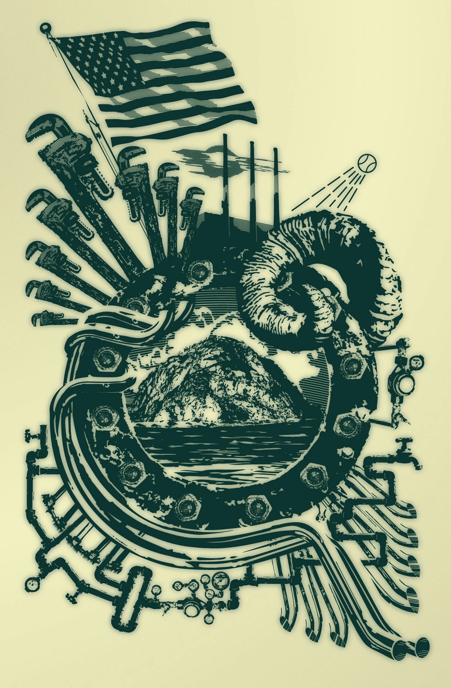
Here is some tattoo art I did recently for an LA sports fan, plumber and gearhead. Twisted and modified images, digital drawing and logo allusions. A blast to do. It has since moved on to revision, but I like this one best.
Over the years I have created dozens of fonts for various companies and projects of every feel. Here are a few. Creating fonts is relaxing - good balance of inspiration and problem solving as we fit vision into the set structure of a font.
Btw - Tina never says she thinks you’re cute - she sends her friend around to say “Tina thinks you’re cute”.
The black pencil flourish was drawn by a fantastic artist, not myself - my job was to keep their beautiful art beautiful as I translated it into spec-ready vectors for rubber stamp production. I solved the issue of pencil shadings by rendering them, giving the design a relaxed, natural and majestic presence. The shading problem was turned into a strong point instead of graphic awkwardness, so both the artist, and the company I worked for, were stoked.
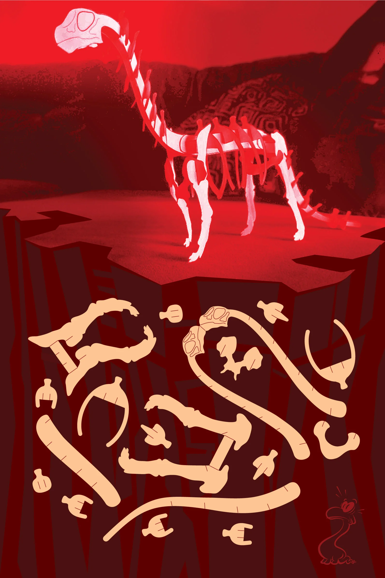
This piece is a metal stamp cut for elementary educators and their students, so that ads “limited pieces” and “Ease of assembly” to the specs, and really challenges the level of anatomical correctness to be displayed. So, Keep It Simple Stupid: I researched brontosaurus skeletons and focused on the major bones - keeping repetitious pieces like vertebrae limited to a few pieces representing the whole. Reinforced the skeleton by design so it could stand alone - also gave it a lumbering gate by angling the hips. This was enough to make it a learning touchstone for educators, yet easy to assemble.


